New case study
A Clearer Vision for Cayman’s Energy Future
Caribbean Utilities Company
BrandStrategy

A rebrand for the Cayman Islands’ national power utility, protecting sixty years of equity while signalling a clearer, more confident future.
Industry
Utility
Vertical
Branding
Location
Cayman Islands
The ask
Refresh a sixty-year-old utility brand without losing the trust behind it
CUC has powered the Cayman Islands for more than sixty years. Over that time the company has grown into a 270-strong organisation operating across four divisions, with renewable energy, smart-meter, and battery-storage programmes that look very different from the utility it started as. The brand had not kept pace. The mark, palette, and applications had drifted across vehicles, signage, uniforms, print, and digital channels, with no single source of truth to hold them together.
The objective was to bring the identity into line with the modern, future-facing utility CUC has become reliable, technical, deeply Caymanian, and visibly committed to a renewable-energy future. The refresh needed to protect the equity already built into the name, give internal teams a scalable system to roll out themselves, and reflect a clear positioning: inspired by Cayman, rooted in the company’s history, designed for the next sixty years.


What we did
A brand system rooted in heritage and built for scale
We started with strategy. Stakeholder sessions, an internal audit, and a public-perception review sharpened CUC’s positioning — not just the power company, but a long-term partner in the country’s growth and a visible advocate for renewable energy on island. That positioning shaped every visual decision that followed.
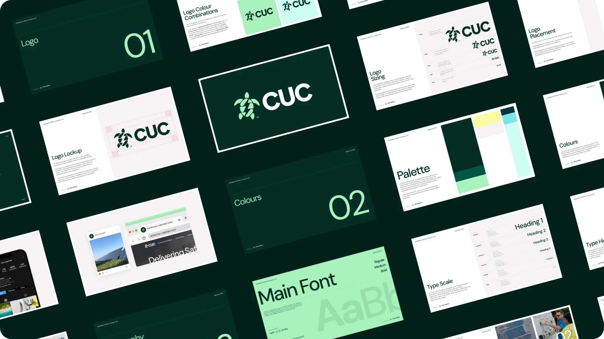
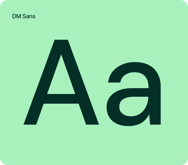
The identity evolved from a recognisable monogram into a complete system. A modernised mark. A confident type voice. And a refreshed palette — iconic green and yellow joined by a spectrum of blues drawn from the Cayman landscape, anchored by Bolt and Current Green and lifted by Charge Mint, Pulse Yellow, Seafoam Blue, Lightstream White, and Lumen Grey — to signal CUC’s commitment to a cleaner energy future without losing what people already recognise.
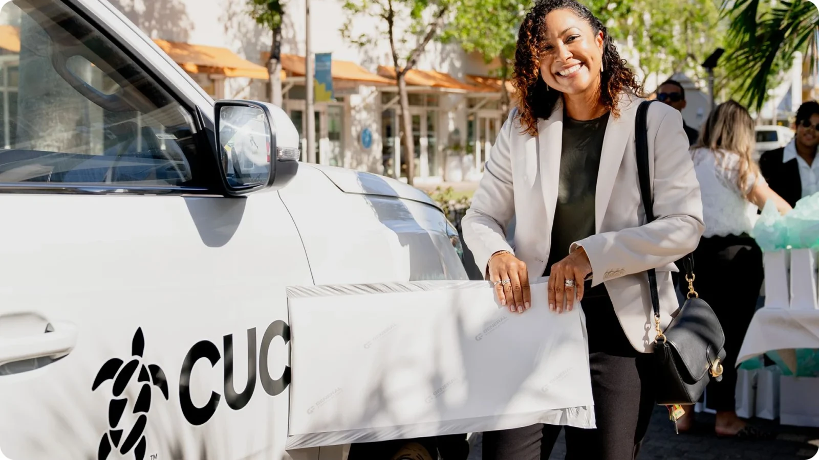
We rolled the system out across vehicle livery, uniforms, signage, print, internal communications, and a refreshed digital presence, with guidelines and templates designed so the in-house team can extend it themselves — keeping the brand consistent across every touchpoint, well past launch.


Current Green
#042F27
Fusion Green
#035445
Charge Mint
#A8F1BD

What we did
Reimagining Sparky, CUC’s mascot since day one
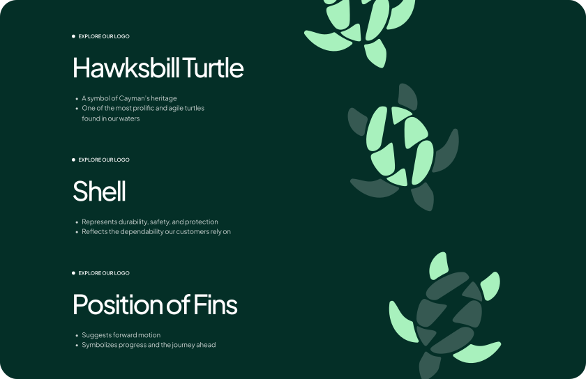
Sparky has been part of CUC since day one, a Hawksbill turtle, native to Cayman, originally tucked inside the company’s mark. Over six decades he has grown into one of the most recognisable characters in Caymanian life.
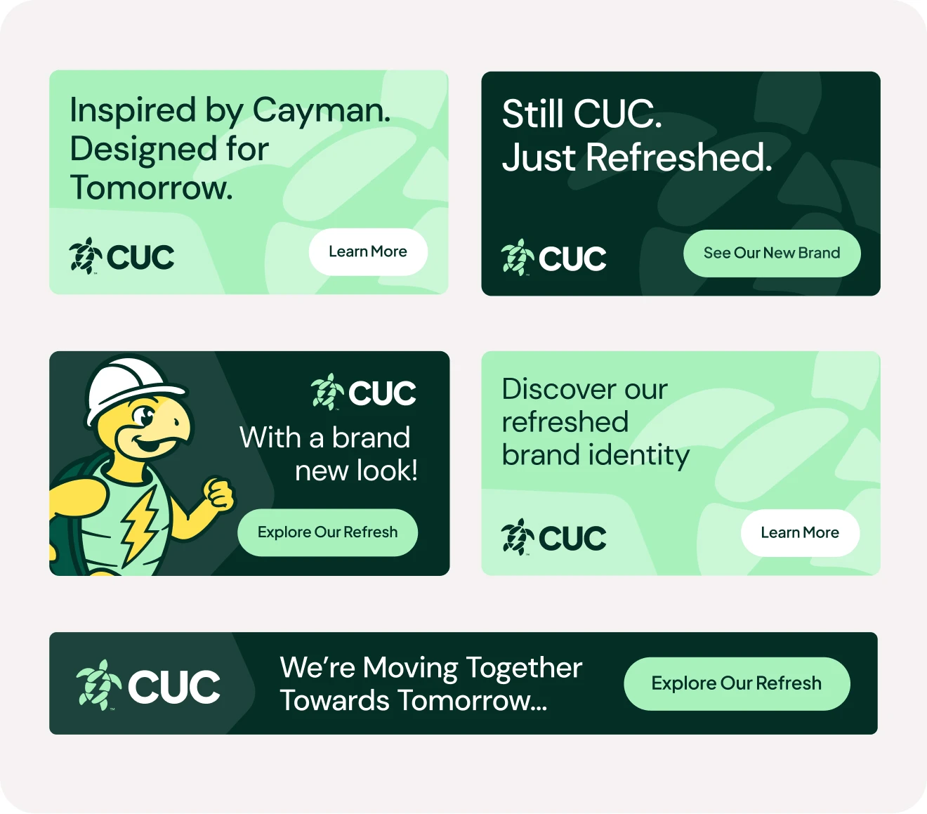
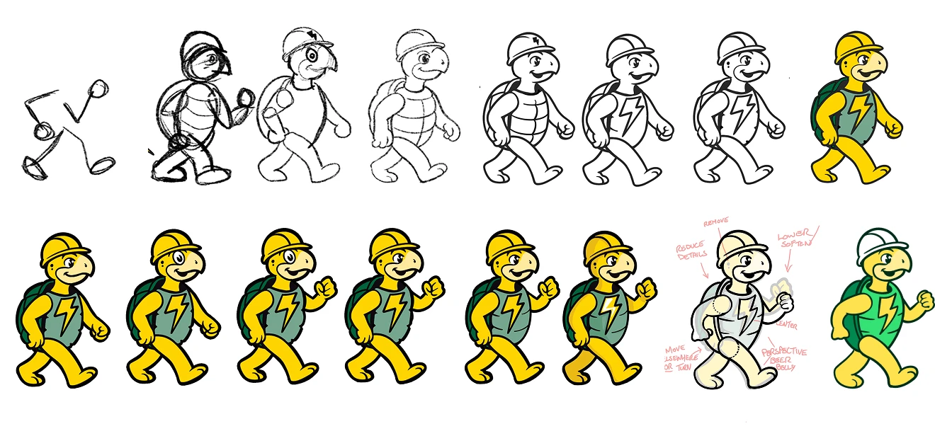
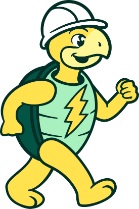
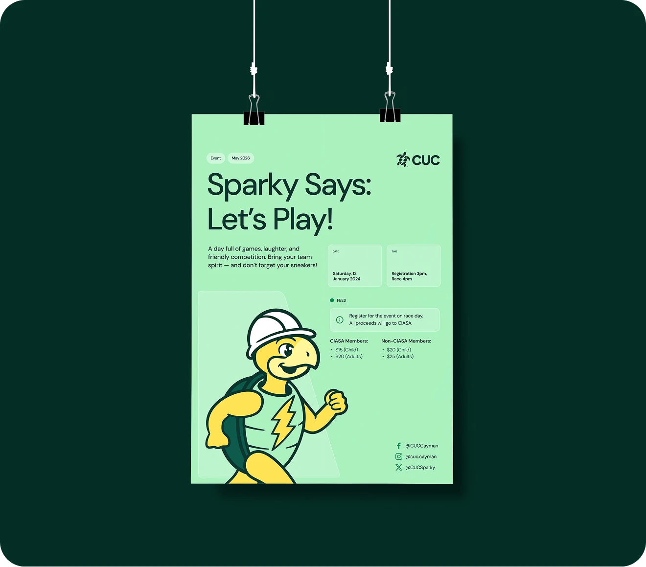
Sparky stepped out of the logo and into a system of his own, restyled to sit alongside the new identity, more expressive, easier to animate, and able to flex across illustration, video, social, and educational content. The visual language stayed unmistakably him: same character, same warmth, with shape, colour, and proportion brought in line with the wider brand system.
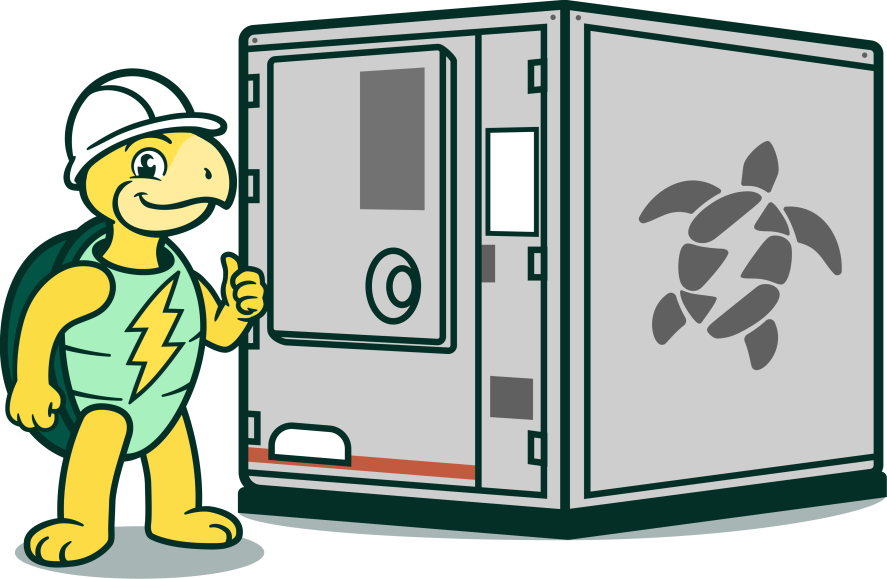
His role grew too. Sparky now leads CUC’s customer-facing programmes, fronting safety guidance, energy education, community initiatives, and renewable-energy stories in a way the brand voice alone never could.

What we did
A choreographed launch across web, video, social, print, and email
The refresh wouldn’t matter if it didn’t land. So we built a launch campaign designed to introduce the new CUC across every channel customers and stakeholders meet the brand on, coordinated so each piece reinforced the next.
A dedicated brand-refresh landing page gave the public a single place to explore the new identity, the thinking behind it, and Sparky’s evolution. A brand film carried the same story in motion, heritage, Cayman, and a renewable-energy future. From there the launch fanned out: a phased social rollout with animated tiles, vehicle-and-installation reveals, and Sparky-led posts; print ads placed across local titles; a customer email sequence that walked account-holders through what was changing and why; and internal communications that gave employees the language and assets to talk about the refresh themselves.
Every piece was timed to land as part of one moment, so the new brand arrived as a single, confident introduction rather than a slow trickle.