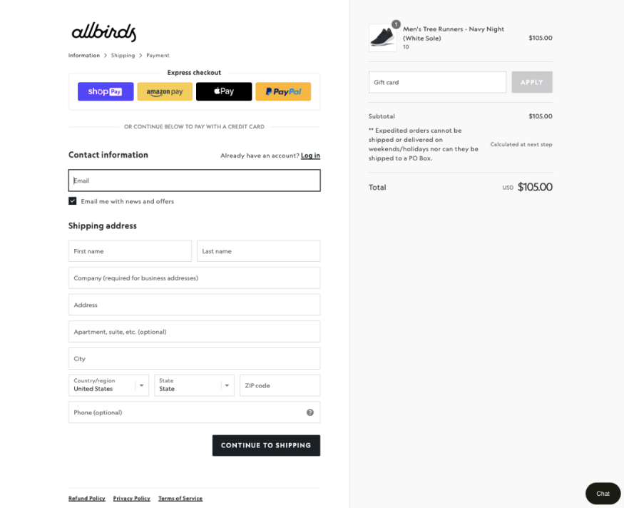
How to optimise a checkout experience for your e-commerce store

As an online business owner, there’s nothing more frustrating than watching potential customers abandon their carts before completing their purchase. Unfortunately, this is a common occurrence in the e-commerce world, with an average cart abandonment rate of 69.99% reported by Baymard Institute. This statistic highlights the need for businesses to focus on perfecting the checkout process, and in this blog post, we’ll dive deep into exactly that.
Simplify the process
The checkout process of your e-commerce store should be as easy as possible, with only a few essential steps. Each additional step or field you add increases the likelihood of customers leaving their carts behind. To simplify it, consider the following tips:
- Eliminate unnecessary fields and questions: don’t ask for more information than you need. Keep the number of fields to a minimum and only ask for what’s necessary for completing a purchase.
- Minimise manual input: whenever possible, use dropdown menus, checkboxes, or autofill to reduce the need for manual input. This saves customers time and effort and also reduces the likelihood of errors.
- Use progress indicators: clearly indicate where customers are in the checkout process and how much more they have to go. This reduces the perceived time commitment.
- Use guest checkout: according to Capterra’s 2022 Online Shopping Survey, guest checkout is the most popular option among consumers when making a purchase online, so you should definitely offer it!
Optimise for mobile devices
Shoppers worldwide are becoming mobile, so you must ensure that your site works on mobile devices – or, better yet, is designed for mobile-first. This means designing the checkout page specifically for small screens, with easy navigation and a mobile-friendly layout. When designing for mobile, you should consider the following:
- Responsive design: ensure that your checkout page can respond to different screen sizes and orientations.
- Mobile-friendly input fields: dropdown menus, checkboxes, and other mobile-friendly input fields that make it easy for customers to complete the form on a smaller screen.
- Large buttons: make sure buttons are large enough to tap easily, and use clear and concise language for button text.

Provide multiple payment options
Customers have different preferences regarding payment methods, and providing more options increases the likelihood of a successful sale. In general, most online stores use the following methods of payment:
- Debit or credit cards
- PayPal
- Digital wallets: Apple Pay, Google Pay, or Samsung Pay
- Other: depending on your target audience, consider offering additional payment options such as Venmo or cryptocurrency

Don’t underestimate the power of language
Clear and simple language is essential for e-commerce because it helps to improve the user experience, while confusing terms or unclear language can cause customers to abandon their cart. Avoid jargon or technical language, and try to sound natural. Keep your sentences short and to the point, and use active voice whenever possible. Here’s why:
- Better understanding: you should ensure that users understand what they are reading. This is important because e-commerce involves various terms, conditions, and instructions.
- Increased trust: if the language used on the website is confusing or misleading, customers may not trust the site or the brand, and they may be less likely to make a purchase.
- Accessibility: simple language can make e-commerce more accessible to a wider range of customers. People with learning difficulties, disabilities, or those who do not speak English as their first language, may find it easier to understand and engage with your website.
- Better user experience: customers appreciate websites that are easy to navigate and understand. Language is such a powerful tool that can improve the overall user experience and make it more likely that customers will return to the site.
- Improved SEO: search engines prefer websites with clear and concise content, and websites that use simple language are more likely to be ranked higher in search results.
Eliminate other potential issues
By being aware of the reasons why customers may leave the checkout page, you can take steps to prevent your conversion rates from going down. The following groups of issues can help you get a better understanding of which other website elements you should take care of:
- Unexpected costs or fees: customers may be surprised to see additional charges such as shipping, taxes, or handling fees added to their order at checkout. To avoid this, be transparent about all costs associated with the purchase, and provide a clear breakdown of fees before customers enter the checkout process.
- Technical issues or errors: this can include slow loading times, broken links, or error messages that appear when submitting the form. Your website should be fast, as this can be essential for your business growth. To prevent technical issues, regularly test your checkout process to ensure that it is working smoothly and efficiently.
- Lack of trust or security concerns: customers may not complete their purchase if they’re concerned about the safety of their personal information or payment details. To build trust, use secure payment methods, display trust badges or security certificates on your site, and provide clear information about your privacy policy and data handling practices.
What next?
Designing a beautiful checkout process is not easy. At AirVu Media we can help you increase conversions and decrease cart abandonments. Contact us today to talk to our team of experts who can help you grow every step of the way.
